Friday, September 29, 2006
About Me
- Name: hiroko tanaka
My name is Hiroko Tanaka and I am a May 2007 graduate of the Temple University with BA in photojournalism. I have worked as a staff photographer at The Temple News, I also served as a photo intern at The Philadelphia Inquirer during my final semester at Temple.


6 Comments:
Hiroko,
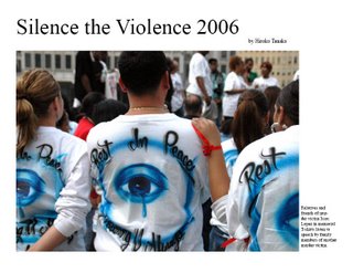
I liked your fall weather picture that played with the shadows. I think that your double truck could have been improved by having more text/photos. There wass too much whitespace, but for the first one of the semester it was good.
I loved the shot of the boy at the top of the page. The doub truck always could use bigger pics, less text/ white space, but such a great concept!
Hiroko--
Definitely loved your double truck photos--especially the ones with the designs on the shirts. Maybe add some more photos in the double truck--because they speak for themselves!
On the double truck, I like how the women have a serious "im listening" look and then on the other side you have a speaker.
The doubletruck is very minimalist but i think it keeps it strong, there isnt' anything weak.
Hiroko,
Your top shot is really really emotional. You just can look at him and feel it.
Post a Comment
<< Home